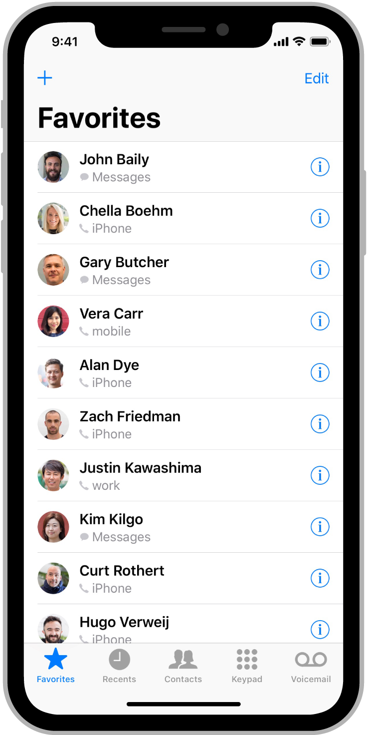
At their special event this morning, Apple announced iPhone X. This is the first iPhone without a rectangular screen, and it presents a variety of new design challenges. On cue, Apple has updated their Human Interface Guidelines.
There are a few things worth noting about iPhone X:
- Screen resolution:
2436px × 1125px(812pt × 375pt @3x) - Status bar height:
44 points(until now, it's been20 points) - Status bar + large titled nav bar:
140 points - Status bar + small titled nav bar:
88 points - Which leaves you with
672 pointsfor your app content when there's a large navigation bar, and 724 pointsof vertical space with a smaller navigation bar.
It also has a "notch" which gets in the way of the status bar, seen below.
Source: https://developer.apple.com/ios/human-interface-guidelines/overview/iphone-x/
Despite the larger screen, iPhone X doesn't use @4x scaling.
There are a few things you can do to accommodate the notch in your app.
- Use a solid background colour for the status and navigation bars. This way, your UI "extends" up behind the status bar, and you don't have to worry about custom UI for all of the different possible navigation bar heights and sizes.
- If your app hides the status bar, reconsider that on this phone. The status bar will always be visible (except when displaying full-screen media). The area surrounding the notch isn't useful for much else, and I think users will come to expect visible status indicators.
- Adopt large title navigation bars in your app. Large titles were introduced in iOS 11, and give extra height to the navigation bar, while bolding the title, and moving it below the navigation button items. When the content below scrolls, say in a table view, this navigation bar "folds" up and the title is placed back in the middle of a standard-sized navigation bar. Using large navigation titles gives a clear indication to the user as to where they are in the app, and with the extended height of the iPhone X, vertical screen real estate isn't so much of a premium anymore.
To convert an existing navigation bar to one with large titles requires only one line of code:
self.navigationController?.navigationBar.prefersLargeTitles = true
Source: https://developer.apple.com/ios/human-interface-guidelines/bars/navigation-bars/
If you're already using size classes, and haven't hard-coded your app's UI, then your app should scale nicely on an iPhone X screen. The iPhone X screen is 375 points wide, which is the same width we've been used to for three years since the introduction of the iPhone 6. The main difference here is the vertical height, which most UI's should be able to adapt to with ease.

