CGM Diaries: Day 0

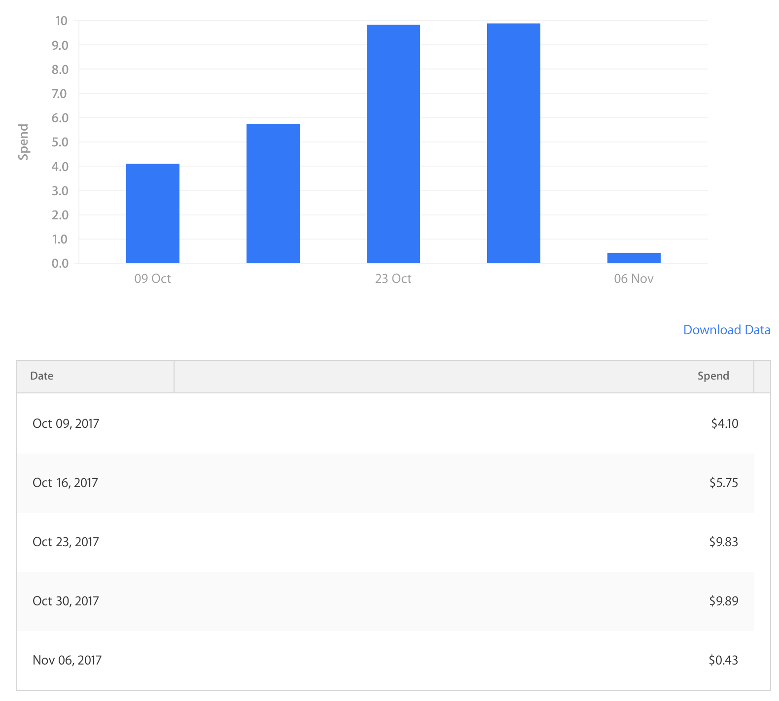
Continuous glucose monitoring, so I'm told, is life-changing technology for people with type 1 diabetes. I spoke to someone last week who told me her HbA1c result (essentially an average blood glucose level over three months) was down to 6.1 mmol/L from 8.1 mmol/L. That's 110 mg/dL and 146 mg/dL respectively. I've heard similar results from others. That is no small improvement, and on top of feeling better in day-to-day life, it dramatically reduces the chance of developing complications from diabetes later in life.

The range of continuous glucose monitors (CGM's) available now are all invasive, meaning they puncture the skin to work. I've written before about what non-invasive blood glucose monitoring would mean for people both with and without diabetes. The idea excites me beyond belief. However, it may still be years away, and for now, the choice is whether someone sees the benefits of CGM enough to accept the tradeoffs. If someone with diabetes is also wearing an insulin pump, expecting them to live with another cannula in their body (generally either in the stomach or back of the arm) may be a dealbreaker.

Inconvenience aside, the cost is probably the most significant factor preventing more people from wearing the current CGM's available. Diabetes Australia says the cost of CGM, including sensors, is around $5000 per year. That's no small amount of money and puts the possibility of wearing a CGM out of reach for many people.

With some notable exceptions, it's nice when an elected Government follows through with an election promise. The current Australian Federal Government committed to wholly subsidising the cost of CGM devices for Australian's with type 1 diabetes who are under the age of 21. This is thanks to tireless lobbying from the Danii Foundation. Fortunately, I am eligible for the subsidy for the next 11 months.

After speaking to the doctor at my last checkup, she agreed a CGM would be beneficial, and I'm scheduled to have have one set up tomorrow (4th December, 2017). The CGM model is the Dexcom G5, which was recommended as it's the most accurate, and can replace all but two "finger-pricks" per day for checking blood sugar. It also transmits data via Bluetooth, and as a result, will sync the data to HealthKit on my iPhone and Apple Watch. The ability to store this data reliably for future reference is a definite advantage.

This is an exciting time when the possibilities are considered. Improved control and management of blood glucose levels will almost certainly lead to advantages I can't even think of at the moment. Because of the integration with iPhone, Apple Watch, and HealthKit, I also plan on writing about it on this blog. Those posts will likely focus on the integration between the Dexcom sensor and this technology, as opposed to how CGM is affecting the management of diabetes and my blood glucose levels. On the other hand, a bulky sensor may be deemed not worth the tradeoff. I'm curious to find out.

While I've got your attention on this topic, we're still raising money for JDRF. Their research leads the way in working towards a cure for type 1 diabetes. Any amount you've got to give goes is greatly appreciated. You can read more, and donate here.

Experimenting with App Store Search Ads

What are Search Ads

App Store Search Ads have been around since October of 2016. Apple describes them as, "An efficient and easy way to promote your app at the top of relevant App Store search results." They were only shown in the U.S. App Store up until April of 2017 when they were introduced to the UK, Australia, and New Zealand. Since then, they've been added to the Canadian, Mexican, and Swiss App Store, bringing the total number of App Store markets with Search Ads to 7.

 
Here's how Petty's Search Ads look on the App Store

Here's how Petty's Search Ads look on the App Store


Petty

I make Petty which is an app for iOS and Android that helps New South Wales (NSW) drivers find affordable petrol nearby. Petty came about because I thought the NSW Government's petrol price dataset looked cool and knew that it was the most accurate one around. At that stage the best tool one could use to view prices from the same database was to use a website, called FuelCheck, run by the NSW State Government. I thought the idea of a decent native app, as opposed to having to visit fuelcheck.nsw.gov.au frequently was appealing.

FuelCheck

About a month ago the NSW Government launched FuelCheck in the form of a mobile app for iOS and Android. Its release was inevitable. As best I could tell, it "soft launched" on the App Store and Google Play a few weeks prior, but the hard launch date was the 11th of October, 2017.

The first I heard about the launch was in a Tweet by the NSW Premier, Gladys Berejiklian.

Naturally, there was a lot of attention given to FuelCheck. Petty and FuelCheck are two different apps and Petty has things to offer that FuelCheck doesn't, including showing the time prices were last updated at nearby stations, an Apple Watch app, notification centre "Today" widget, and - as I Tweeted at the time - assurance that you aren't using something made by the government.

It was half-jokingly suggested by a friend of the blog (who didn't get a say in their friend of the blog status) Pat Murray to buy Search Ads on FuelCheck's search terms. That evening, I set up an ad campaign and did precisely that.

Search Ads for Petty

To provide some context, Petty is a free app with optional in-app purchases (IAP). Most of its (insignificant) revenue comes from the IAP to unlock "premium" mode - removing ads and getting extra features. The rest is from an optional tip jar. The money made on display ads is so small it might as well be a rounding error. It's worth noting that any money or dollar figures mentioned are in Australian dollars (which, for the fun-fact enthusiasts among you, is the fifth most traded currency. The ads for Petty were only shown to customers who have not previously downloaded the app, and those who were located in Sydney, Australia.

The ad campaign

I hadn't run a Search Ads campaign since Apple gave $100 in free credit at launch to every developer encouraging them to try it out. Early on it was established that I was only willing to throw $30 at the ad campaign and that the ads were going to run on the iOS App Store only despite there also being an Android version of Petty. $30 sounded like a nice number - small enough that it didn't matter if it resulted in zero additional revenue, but enough to gather some data with. I expected the ad campaign to be over sooner than it was, as maximum daily spend was set to $7.00. It took almost a full month for the $30 budget to be exhausted.

Here's a breakdown of the spend per week

Here's a breakdown of the spend per week

Results

The ad campaign finished with 927 ad impressions, and 168 taps on those ads which converted into 101 installations of the app. This gives a tap through rate (TTR) of 18.12%, and a conversion rate (CR) of 60.12%. I'm particularly impressed with the CR which shows that a majority of people pressing the ad were interested, and went on to download it. There isn't much public data I can compare this to, but it's slightly higher than what early results for Search Ads showed - a good sign overall.

CPA

The most important metric when running an online ad campaign for an app is the cost per acquisition (CPA) of a customer. This campaign saw an average CPA of $0.30, which is lower than I expected, even for a free app.

CPA is an important metric because it tells you whether or not your campaign is worthwhile. The marginal cost of an additional customer of your app is almost zero. In a simplistic model, take average cost per customer (such as data, and server expenses) away from average revenue per customer, and you're left with a bit more than the amount you can afford to spend to acquire a new customer.

These keywords were the only three to see meaningful results 

These keywords were the only three to see meaningful results 

Keywords

The ad campaign began with only a few keywords: petrol prices, fuelcheck, fuel check, and fuel watch. Throughout the month the ads were running, I increased the number of keywords that ads were running against. At the end of the campaign, only three keywords generated more than 100 impressions, and more than 5 installs each. They were: petrol prices, petrol, and fuel watch.

 
Ads_Android_iOS.png
 

Interestingly enough, ads for Petty did not score so much as a single impression on either "fuelcheck" or "fuel check" - the two most important keywords set. I know the Government themselves were bidding directly on that keyword, as were 7-Eleven with their fuel app, and their default CPT bid was likely a lot higher than the $2.00 I set for Petty ads.

 
After a few days, "fuel watch" was trending, but not, "fuelcheck."

After a few days, "fuel watch" was trending, but not, "fuelcheck."


That means these ads weren't shown to people who were visiting the App Store and searching for FuelCheck directly. The ads likely were shown to people who had heard about the Government's app but weren't sure what it was called. It is interesting that a trending search term on the App Store only three days after the launch of FuelCheck was "fuel watch." It trended for about 24 hours, and as you can see from the data above, that was the single most popular search term for Petty's ads during the campaign.

Wrapping up

There are a few key points to take away from this experiment. Search Ads on the App Store work. Unlike Facebook or Google Search ads, where you pay $20 only to get the email, "Your campaign has ended, and your page has ONE new like!" Your mileage may vary, but the $30 I spent resulted in just over 100 new customers, at a cost to me of $0.30 per customer. As far as CPA goes, it was an effective means of advertising. Another thing to take out of this is that you don't need to spend a lot of money to see results. $30 was enough in this instance, and it lasted nearly a month. $20 probably would've been just as fine. Play around with different ads and keywords to figure out what works for you and your app. Run an inexpensive campaign to figure out what your CPA is, and go from there. I also learnt it's difficult to outbid the "big guys." They're almost certainly going to bid higher on the popular terms, such as "FuelCheck," so it's important to find some moderately popular, niche keywords ("fuel watch," in this case) to see results.

There's more data that you can take from a Search Ads campaign and more detailed analysis to be done on the data than I've written here. I hope this provides a good overview of what to expect when you run a Search Ads campaign and how it can be an inexpensive way to attract more customers to download your app.

iPad Productivity at Uni

I think a lot about productivity, and how to be more efficient when working. The most prominent challenge for me relates to University work. I've always found it easier to achieve "deeper work" (more extended, uninterrupted periods of working time) when working on side projects than when doing things for Uni. This will be a short post, but I'm writing it here as opposed to on Twitter because Twitter dot com doesn't need another Tweetstorm.

I'm in an arguably lousy habit of working on side projects while at Uni. It begins when I pull my laptop out on the bus, start working on something, and then continue that when I get to Uni. Sometimes this means spending the first few minutes of a class wrapping up said work. Later, during the next break between classes, I'll continue. Procrastiworking (doing productive work that just isn't the work you should be doing at present) isn't inherently bad; however, it does mean I'm not working on Uni work at Uni outside of time in class. I tend to do most of my Uni work at home, and I get it all done there without issue, so I guess I'm trying to complete more while at Uni.

In a hypothetical world where I only take an iPad to Uni (as opposed to the MacBook Pro I carry now), I would probably be able to complete about 80% of the work I need to. The remainder (subjects involving programming assignments) would have to be done at home, but seeing as though I already do most of my Uni work at home that would be fine. I could take notes with an Apple Pencil, access all of my folders and documents through the OneDrive (or Files) app, and browse the Internet to conduct research. iOS on the iPad has come a long way recently and is certainly up for the challenge.

In this hypothetical world, I can see things going one of two ways. Either the iPad helps with focus at Uni, or it doesn't. Sounds obvious, right? There's no decent IDE for me to open and start working on a project with, so in theory, I'd have to do Uni work. This would also apply to time on the bus. If I pulled out my computer - in this case, an iPad - the only productive tasks I could complete would be work for Uni. The second possible outcome is that I just find another way to be distracted. More Twitter perhaps? Goodness knows I need less of that in my life. If the latter proved to be correct, it would be a net loss of productivity. There would be no procrastiworking, but no additional "real work" completed either.

No conclusion has been reached here. It was just a fun little thought experiment on my last day of classes for the year. I almost certainly won't buy an iPad for Uni, but it's fun to think about different ways of working.

Even the act of writing this was a form of procrastiworking between classes. Bring on exams. 🙃

Petty 1.1

Today, the first major update to Petty (v1.1) goes live today on both the App Store and Google Play Store. It introduces a search feature - you can now search for any station in NSW, view its price list, and get directions. There's also a new Today Widget, and Apple Watch app for iOS users. The update also intentionally coincides with the public release of iOS 11, as it adopts some of the new iOS 11 design trends. Mainly the large title/navigation bars.

Side by side.png

I was reluctant to adopt the new navigation bars, as I'm not a fan of the look, but after seeing iPhone X and how they blend in on that display, I became more convinced it's the right choice. It's also just a good general rule to follow the design patterns of the platform you're designing for.

 
Search.png
 

Search, it's here! Ideally, this would've made it into v1.0, but I ran out of time. It can't be more straightforward to use. There's a search bar up the top of the app on iOS, or a search button on Android. Use it to search for petrol stations in NSW. Analyse the results to your heart's content.

 
Today Widget.png
 

If you're a widget person, there's now one for you on iOS. Petrol prices, they're everywhere. Why not, right? You can access the expanded version from Notification Centre, which shows you the closest station and its full price list. The smaller version, which can be accessed by 3D Touch-ing the Petty app icon on your home screen, just shows you the closest station, its distance, and address. There's no room for a price list there.

 
Apple Watch.png
 

Do you wear a shiny computer on your wrist? If so, this update is for you. Petty now has an Apple Watch app. It will show you the nearest station, its distance, and its address. You also get the option to view the station on a map. That is all. I can't label the station, give it any other metadata, nor can you interact with the map. If you want directions, you'll be booted to the Maps app on the Watch. Unfortunately, that is a current limitation of showing maps on the Apple Watch. Hopefully, it changes in the future. This feature may be especially useful if you've got, or are getting, a fancy new Apple Watch with a red circle on the crown. If you do, that means you've got a watch with a cellular connection. You don't even need your phone to find petrol - how cool is that? It's almost as though I preempted the lack of need to carry your phone around while driving and running errands. I am, however, definitely overestimating how keen you are to know petrol prices. Moving on.

Actually, there's nothing to move on to. That's it for this update. I hope you like it. There will be more to come in the future. Let me know what you think.

Like the look of Petty? Download it here for free.

If you're a fan, maybe tell your friends, and then drop a 5-star review for Petty on the App Store and Google Play, it's appreciated. For more updates, you can follow me on Twitter - @zachsimone - where I'll sometimes post previews and sneak peeks.

Social media 2.png

HealthFace 2.0 Overview

This week's update to HealthFace is the first since May. On the same day that the last update hit the App Store, I had a Twitter exchange with the developer, Quentin. As a result of this exchange, I became a regular user of the app.

The new views in HealthFace 2.0 for data entry and extension customisation

The new views in HealthFace 2.0 for data entry and extension customisation

HealthFace is a health app for iPhone and Apple Watch. Version 1.0 was all about displaying data from Apple's Health app on the watch face of an Apple Watch via the complications feature. Version 2.0 came out earlier this week and turned the app into so much more. It's now my go-to app for inputting data into the Health database on my phone. Manually inputting data through the Health interface is clunky and unpleasant. HealthFace solves this.

 
The new Apple Watch input feature 

The new Apple Watch input feature 


My use of HealthFace begun by setting up a complication on the face of my Apple Watch to display a 7-day average of my Blood Glucose level. To this day, I have the same complication in the same spot on the same watch face on my Apple Watch. Around the same time, I began saving every BGL reading taken into the Health app on my iPhone. I have type 1 diabetes, and this information is useful at a glance to learn how well I've controlled my blood sugar for the last week. If HealthFace just offered custom complications, that would make it a good enough app to keep around. Over the last few months, I've excitedly watched it transform into something that takes it from a niche app and turns it into something for everyone - with or without an Apple Watch.

 
Using the Today Widget is a quick way to input data

Using the Today Widget is a quick way to input data


Everyone has a health metric they need to track. For some, it's blood pressure, or volume of water consumed. For others, it's simply daily weight measurements. By keeping on top of these metrics, it keeps them front of mind, and can subconsciously encourage better habits. Every iPhone ships with the Health app which can serve as a fantastic collection of all kinds of health data. If there's a health-related metric you want to keep on top of, there's an excellent chance you can record that data in the Health app. HealthFace 2.0 enables easy entry of this data into your health database. You can enter it from the main iOS app, from a widget on iOS (meaning you can enter data when your phone is locked), and on the Apple Watch. I use all three methods depending on the situation I'm in, but I find input via Apple Watch particularly useful.

 
The input interface is unique yet intuitive 

The input interface is unique yet intuitive 


Above is an example of the custom input mechanism built into the iOS app. There's a stepper to increment the value, and also a touchpad which can be used to "slide" the values. It's faster and more intuitive than using the Health app to save data.

The app is fully customisable. You can choose types of data and set them as "favourites." These favourites then appear across the iOS app, widget, and watch app, or you can choose different types of data for each app extension. e.g. Blood glucose and blood pressure on the widget, but water intake and body temperature on the Apple Watch. Everything Quentin's added to this update aids the goal of quickly adding data to health.

Interestingly enough, the "Complications" tab - which used to be shown on the first launch - is in the fourth spot as of v2.0. This illustrates the focus of the app has changed with this update, emphasising the other features of the app.

 
New icons!

New icons!


As a nice bonus, there are some new custom app icons. HealthFace is no longer an app for just people with an Apple Watch. It's an app for everyone with an iPhone. It's available on the App Store for A$2.99 (US$1.99).

Apple Lays the Groundwork for Apple Watch That Monitors Blood Glucose

I've previously written about the significance of non-intrusive glucose monitoring, and what that would mean for both diabetics and non-diabetics. It's rumoured that Apple is working on it, and will likely tie it into a future model of the Apple Watch. Unsurprisingly, the Apple Special Event yesterday morning came and went with no mention of blood glucose monitoring in the new Apple Watch Series 3, which means it's at least a year away, if not two.

I couldn't help but notice that at WWDC this year there were many nods towards insulin delivery and blood glucose level tracking in the Apple Health app. It was even mentioned in the "What's New in Health" session.

This shows, at the very least, diabetes management is something Apple is interested in. During the Apple Watch section of the presentation yesterday, Apple played a "Dear Apple" video highlighting many different ways in which Apple Watch has enabled its wearers to lead healthier lifestyles. You can watch the full video on YouTube.

I was particularly interested to see that the father of a young girl with diabetes was one of the narrators of the video. Around 90 seconds into the video, we hear this man read part of his letter aloud. He says, "Dear Mr Cook, our daughter was recently diagnosed with type 1 diabetes." He continues 19 seconds later, "The integration of her glucose monitor with the Apple Watch lets us make sure her blood sugars don't go to dangerously low levels."

A few moments later, Jeff Williams took the stage to announce an improved heart rate monitoring app in watchOS 4. The new version of this app wasn't in any of the betas, so it came as a surprise. This app gives more detail and new measurements such as resting, and post-workout recovery heart rates. This kind of fundamental analysis makes the heart rate monitor on the Apple Watch more useful to more people, as you no longer need to rely on third-party apps to analyse the data. It's also useful coming from Apple as they're able to do more than third-party developers used to be - such as keeping the heart rate sensor on for a few minutes after a workout to get an accurate indication of a wearers recovery heart rate. They're also providing a complication to show the latest heart rate data, as well as offering notifications for abnormal heart rates. It's an important update, which I have no doubt will save lives.

After thinking about it some more, I realised it's precisely the kind of app you'd need to make if the Apple Watch was to monitor blood glucose. There would be no point to a watch that measured blood glucose without having a way to display that data back to the wearer. Furthermore, for it to be truly useful, it would need to have the ability to send the wearer a notification if their blood glucose reached a level that was either too high or too low. In the middle of the night, this could prevent a person with diabetes from having hypoglycaemia. The features added to the heart rate app translate almost perfectly into what I'd expect an app for blood glucose monitoring from Apple would do. It feels like they're laying the groundwork for something else here.

Of course, nothing is certain until it gets announced. Every "rumour" that Apple is working on an Apple Watch with blood glucose monitoring could be false. However, based on what they've said and done lately, and the direction they seem to be headed in, I'd say that's unlikely. When blood glucose monitoring does come to the Apple Watch, it'll be reassuring to know that Apple has thought long and hard about it, and is ready to offer a feature that could be life changing for so many people. I'm excited for technology like this to exist, from Apple or otherwise, and if having to wait means the product is reliable when it comes, I'm happy to wait.

Pride.codes

If you've visited the main page of my site in the last week or so, you would've noticed a new banner in the top right-hand corner.

This clean, simple "Vote Yes" banner was designed and developed by Pat Murray and Jack Skinner, and is part of many banners available for website owners to implement, as a part of their Pride.codes project.

As Australians begin to receive their voting forms for the same-sex marriage survey, these banners are a nice way to show support for the LGBTQI+ community.

Some further examples include the front page of The Sizzle, Jake Araullo's site, and Pat's site.

The project is open source, and you can contribute on GitHub should you wish, or follow the Twitter account for updates.

If you're able, and would like to show your support, I'd encourage you to check out pride.codes, and add a banner to your site too.

Updating Your App for the iPhone 8 Navigation Bar

At their special event this morning, Apple announced iPhone X. This is the first iPhone without a rectangular screen, and it presents a variety of new design challenges. On cue, Apple has updated their Human Interface Guidelines.

There are a few things worth noting about iPhone X:

  • Screen resolution: 2436px × 1125px (812pt × 375pt @3x)
  • Status bar height: 44 points (until now, it's been 20 points)
  • Status bar + large titled nav bar: 140 points
  • Status bar + small titled nav bar: 88 points
  • Which leaves you with 672 points for your app content when there's a large navigation bar, and
  • 724 points of vertical space with a smaller navigation bar.

It also has a "notch" which gets in the way of the status bar, seen below.

 
Source: https://developer.apple.com/ios/human-interface-guidelines/overview/iphone-x/

Source: https://developer.apple.com/ios/human-interface-guidelines/overview/iphone-x/


Despite the larger screen, iPhone X doesn't use @4x scaling.

There are a few things you can do to accommodate the notch in your app.

  • Use a solid background colour for the status and navigation bars. This way, your UI "extends" up behind the status bar, and you don't have to worry about custom UI for all of the different possible navigation bar heights and sizes.
  • If your app hides the status bar, reconsider that on this phone. The status bar will always be visible (except when displaying full-screen media). The area surrounding the notch isn't useful for much else, and I think users will come to expect visible status indicators.
  • Adopt large title navigation bars in your app. Large titles were introduced in iOS 11, and give extra height to the navigation bar, while bolding the title, and moving it below the navigation button items. When the content below scrolls, say in a table view, this navigation bar "folds" up and the title is placed back in the middle of a standard-sized navigation bar. Using large navigation titles gives a clear indication to the user as to where they are in the app, and with the extended height of the iPhone X, vertical screen real estate isn't so much of a premium anymore.

To convert an existing navigation bar to one with large titles requires only one line of code: self.navigationController?.navigationBar.prefersLargeTitles = true

 
Source: https://developer.apple.com/ios/human-interface-guidelines/bars/navigation-bars/

Source: https://developer.apple.com/ios/human-interface-guidelines/bars/navigation-bars/


If you're already using size classes, and haven't hard-coded your app's UI, then your app should scale nicely on an iPhone X screen. The iPhone X screen is 375 points wide, which is the same width we've been used to for three years since the introduction of the iPhone 6. The main difference here is the vertical height, which most UI's should be able to adapt to with ease.

Introducing Petty

About Petty

Introducing Petty. Petty is a mobile app to help NSW drivers find the closest petrol nearby. Available on iOS and Android, Petty is great for when you're in an unfamiliar area, or when you just want to check the price of petrol at the local service station up the road.

I should state upfront that Petty is only available to download in Australia 🇦🇺, and is only of use to those in the state of New South Wales.

Why Petty

Petty stands out by using the most accurate data, collected by the NSW government, and updated in real time as stations around the state change prices at the pump. Who needs unreliable crowdsourced data that's only updated every fortnight anyway?! It's also available on both major mobile OS platforms.

Features
  • Sort by price and distance
  • Set preferred type of petrol
  • View the location of each station on a map
  • Directions to each station through the Maps app
  • Available on both iOS and Android
  • A clean, modern design.

The ACCC estimates drivers who time their purchases of petrol and choose to buy from the lowest priced retailer can save $10 to $15 per 60-litre tank. (news.com.au, 2017) Petty can help with this, by always keeping you in the loop with up to the minute petrol prices.

Price (or lack thereof)

Petty is free to download, with a single in-app purchase that removes all advertisements and unlocks "premium" mode - meaning Petty will then remember your preferences for sorting by price/distance as well as your preferred petrol type. The iOS version also has an optional tip jar, because that's what the cool kids are doing these days. In the future, I plan to add more premium-only features.

Why ads

Ads aren't exactly great. I don't like ads, and you almost certainly don't like them either. In an ideal world, Petty would be free to download without ads, and hopefully premium mode would be enough to make a small amount of money. It's a side project, and any small amount is nice (I have put quite a bit of time into this), but I don't need it to make money. The simple reason why it has ads is that accessing the price dataset costs me. While I can afford to not make money off of Petty, I can't afford to lose money. If you dislike ads, premium mode will get rid of them. I hope that's a fair solution.

Android version

Petty begun as a iOS project mainly because I wanted to see just how good (or not so good) the NSW government was at providing a data set for devs, and I'm familiar with iOS development. It turns out, the dataset isn't half bad, and is incredibly accurate. The iOS app was probably about 80% complete when I decided to develop Petty for Android. Having never developed an Android app before, it was an interesting challenge and good learning experience. In hindsight, this would've been the perfect project to build with React Native, had the iOS version not been so far along. So between long weeks at work and Uni, the Android version was mostly built on my train rides to and from. Before you ask, it's written in Java and not Kotlin. The Android version isn't perfect and doesn't have the same level of polish as the iOS app, but for my first Android project, I'm pretty happy with how it's turned out.

Petty is the type of app that I could keep adding features to, and I have a pretty good list of ideas (thanks in no small part to the awesome group of beta testers). Now that 1.0 is out the door, you can expect to see updates rolling out over time with new features and additions.

Like the look of Petty? Download it here for free.

Want to get in touch? Reach me on Twitter, or shoot me an email.

Jeff Jarvis at the Launch of the UTS Centre for Media Transition

Last night I had the privilege of listening to Professor Jeff Jarvis - author, blogger, podcaster, advisor, and public speaker - talk at the launch of the UTS Centre for Media Transition.

Professor Jarvis gave insights into the future of media, beginning with the issue of fake news. He noted that it's less of an issue in Australia, but it was interesting to hear his take. Journalists need to be trusted by the public, he argued, and people should want to go to journalists for news.

He also spoke about business models saying, "There is no God-given right to make the money we used to." Jeff acknowledged the changing landscape making the point that media isn't so "mass" these days, and new, more niche journalism needs to reward value, not reach. One of the points he raised was that journalism needs to go to where the people are, even if that means making memes to get messages across.

Jeff briefly touched on the success of the likes of Facebook and Twitter, saying they won because they took risks and offered advertisers what journalists didn't - information about the audience.

It's no wonder Jeff is so well respected in the industry. He spoke well and was able to offer deep insights on a topic that he's knowledgable about. Sitting there, I was wondering if it's Jeff's background in technology journalism that helps him identify these issues, and see changes that need to be made. It's too easy to get stuck in our ways, but if industries don't move forward with the dramatic changes brought about by technology in mind, they may cease to have a place in the market.

Thanks to UTS for inviting such a great guest to launch the Centre for Media Transition. Everyone in the room walked away with something to think about thanks to the knowledge Jeff imparted upon us.